The short answer
- A redraw rebuilds the logo as clean vector, it does not trace the pixels
- Auto-tracing produces ragged paths that look fine on screen
- Identify the typeface rather than outlining traced letterforms
- Check at print size and against the original at every stage
- Refuse where you have no right to redraw somebody else's mark
Every decorating shop redraws logos. The customer has a small compressed image, the job needs clean artwork, and somebody has to rebuild it. Done properly it produces an asset the customer keeps; done by pressing a trace button it produces a file that causes problems for years.
Why redraw at all
What a clean vector gives you
- Scales to any size without loss
- Separates cleanly for screen printing
- Drives cutters and engravers directly
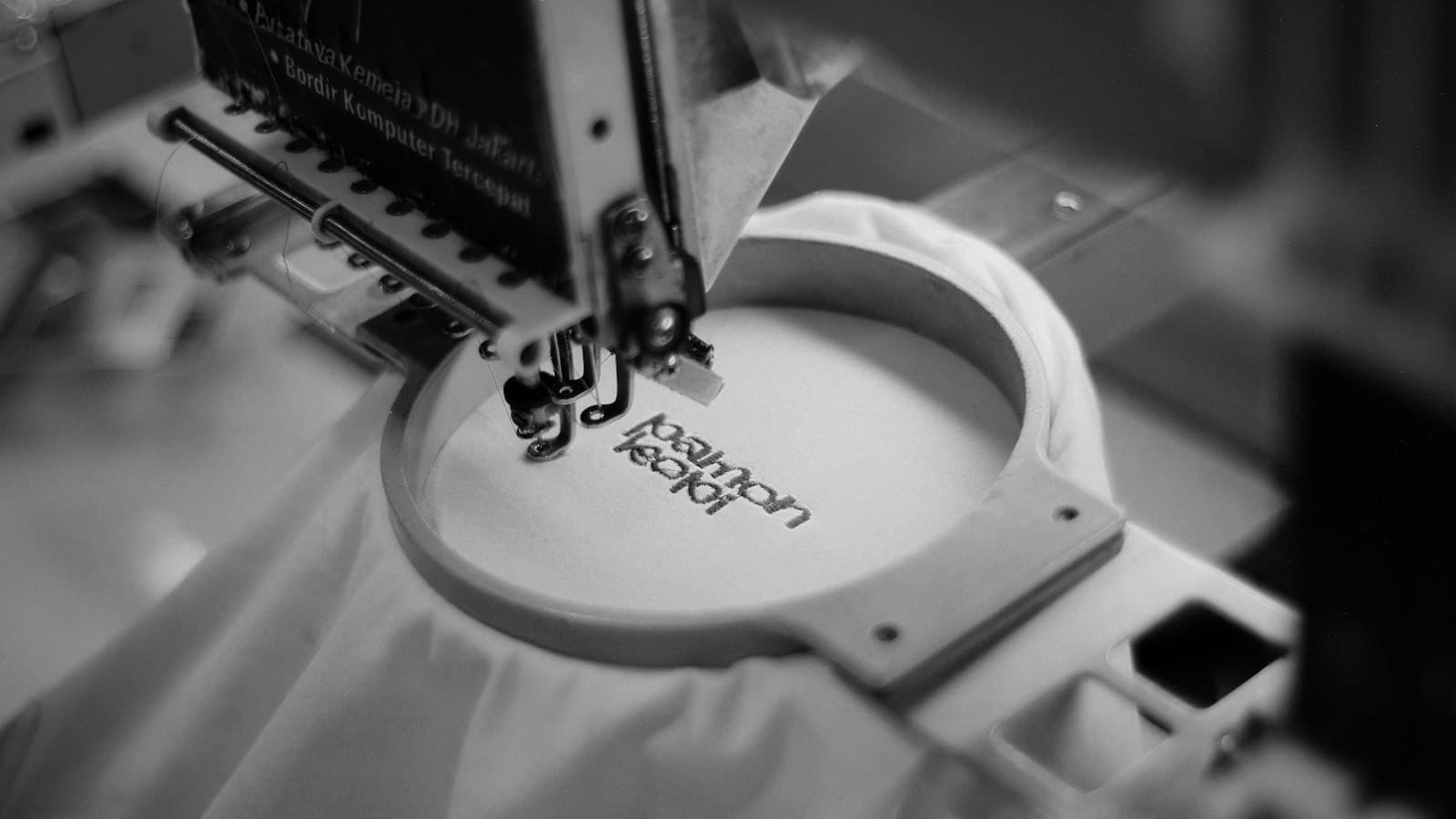
- Digitises better for embroidery
- Colours defined as spot references, not sampled pixels
- Editable when the brand changes
It also ends the problem permanently. A customer with a redrawn logo on file never sends a screenshot again, which removes the most common friction in the whole quoting process — the case is made in why vector is worth asking for.
You are not tracing an image. You are rebuilding the logo somebody originally drew.
Why auto-trace fails
| Symptom | Consequence |
|---|---|
| Hundreds of unnecessary anchor points | Wobbly curves, awkward to edit |
| Edges following compression artefacts | Ragged outlines at print size |
| Letterforms traced instead of set | Type that is subtly wrong |
| Colours sampled from a compressed image | Not the brand colours |
| Circles that are not round | Obvious once enlarged |
| Overlapping and stray paths | Separation and cutting problems |
The trap is that all of this looks acceptable on screen at small size. It becomes visible at print size, on a garment, in front of the customer — and by then the file has usually been used several times.
The method
Rebuild, do not trace
- Place the original as a locked reference layer
- Draw geometric shapes with the geometric tools — circles as circles
- Build curves with as few anchor points as will do the job
- Use symmetry: draw once, mirror or rotate
- Keep elements on separate layers
- Name colours as spot references, not sampled values
- Compare against the reference constantly at 100%
Fewer points is the mark of a good redraw. A curve built from four well-placed anchors is smooth, editable and scales cleanly; the same curve from forty traced points is none of those things.
Ask for the largest original available before starting. A print, a signed vehicle, a business card scanned at high resolution — anything is better than a small web image, and ten minutes asking can save an hour drawing.
Type
Text is where redraws are most often given away. Traced letterforms are almost right, and almost right in typography is immediately visible to anyone familiar with the logo.
Handle type properly
- Identify the typeface — font identification tools are good now
- Set the text live, then match spacing to the original
- Match any custom modifications deliberately
- Outline the type only once it is correct
- Keep an editable copy before outlining
- Never substitute a similar font silently — say so if you must
Keeping an editable version before outlining is what makes future changes possible. A logo whose text exists only as outlines cannot be updated when the company name changes, and the whole redraw has to be repeated.
Where the typeface genuinely cannot be identified, drawing the letterforms is legitimate work and should be priced as such. It is slow, and it is the difference between a redraw and a rough approximation — the same distinction as type that works on a garment versus type that merely fits.
Checking it
Before it is used
- Overlay on the original at high zoom and compare
- View at actual print size, not fitted to the screen
- Check every curve for wobble
- Confirm circles and straight lines are true
- Check spacing and alignment against the original
- Print it on paper and look at it
- Test it small — logos end up on caps and left chests
The paper test finds things the screen hides. A logo that looks clean on a monitor can show uneven weight or misaligned elements on paper, and the check costs a sheet.
Testing small matters because the same file will be used at every size. A logo that works full front and closes up at chest size is only half redrawn — and the small version may need its own simplified variant.
Delivering it
What to keep and what to hand over
- The layered working file, with live type
- A production version with type outlined
- Versions in the colourways you will actually print
- A one-colour version — you will need it
- A reversed version for dark garments
- Colour references recorded against the customer
- A version number and date
Producing the one-colour and reversed versions at the same time costs minutes and saves the job being reopened every time somebody orders a different garment — and it makes the single-colour option immediately available to sell.
Store all of it against the customer rather than the job, so the second order starts from the finished asset. That is the point of the exercise, and where those files sit in the system customers order through, the redrawn logo is what gets placed on every future garment automatically.
When to refuse
Do not redraw
- A third party's trademark the customer has no rights to
- Sports team, brand or character marks without a licence
- Anything where the customer cannot say who owns it
- A logo where the designer holds rights and objects
The risk is yours as well as theirs. A shop that redraws and prints somebody else's mark is the party that produced the goods, and a customer's assurance that it is fine is not a defence.
Ask plainly who owns the logo before quoting a redraw. In the overwhelming majority of cases the answer is straightforward, and the question costs nothing — which makes it worth asking every time rather than only when something feels wrong. The rest of the artwork archive assumes a redraw was built rather than traced.