The short answer
- Fabric is textured and moves; type behaves differently than on paper
- Thin strokes and small counters are the first things to fail
- Embroidery has hard minimum sizes — below them, lettering fills in
- Never use artificial letter spacing to fix a fit problem; change the size
- Print a physical sample of anything with small type
Type that looks elegant in a design application can be unreadable on a shirt, and the reasons are physical rather than aesthetic. Ink spreads slightly, fabric has texture, garments move, and stitches have a minimum width no digitiser can reduce.
Knowing where the limits are means designing inside them rather than discovering them on press — which is one of the more expensive ways to learn.
Why fabric is different
| Factor | Effect on type |
|---|---|
| Ink spread | Strokes thicken; counters close |
| Fabric texture | Edges break up on knits and fleece |
| Stretch | Type distorts when worn |
| Viewing distance | Read at metres, not centimetres |
| Stitch width | A hard floor on embroidered detail |
Viewing distance is the one designers most often forget. Garment type is read across a room, from a photograph, or at a glance — never at the distance you designed it at.
Nobody reads a shirt at arm's length. If it does not work from three metres away, it does not work.
Minimum sizes
Every method has a size below which lettering stops being reliable, and the differences between methods are large.
| Method | Practical minimum | Limiting factor |
|---|---|---|
| Screen print | Small, with care | Mesh count and ink spread |
| DTG | Smallest of the four | Fabric texture |
| DTF | Small | Film detail and weeding |
| Embroidery | Largest minimum | Stitch width — a hard limit |
| Cut vinyl | Moderate | Weeding fine counters |
Screen printing's limit moves with the setup. A fine mesh with a well-tensioned screen holds far more detail than a coarse mesh laying heavy ink, so the answer depends on your own shop rather than on a published figure.
Establish your own minimums by testing rather than by rule of thumb, and write them into the artwork guidance you send customers. A stated limit prevents the design arriving too small far more effectively than fixing it afterwards.
Weight and detail
Stroke weight matters more than point size. A bold face at a modest size outperforms a light face at a large one, because it is the thin parts that fail first.
What breaks down
- Hairline serifs — the first casualty at any size
- Thin strokes in light and ultra-light weights
- Small counters — the enclosed spaces in a, e, o, g
- High-contrast faces where thick and thin sit together
- Script fonts with fine connecting strokes
- Outlines thinner than the ink can hold
Counters closing is the failure that ruins legibility fastest. When the middle of an e fills with ink it becomes an o, and a word with two filled counters stops being a word at all.
Choose faces built for the constraint. Medium to bold weights, open counters and low stroke contrast survive decoration; delicate display faces do not, however well they read in the brand guidelines.
Spacing
Ink spread closes gaps, so type set tightly on screen prints tighter still on fabric. Letters that touch are letters that merge.
Open the spacing slightly for print, but never use artificial letter spacing as a fitting device. Stretching a word across a chest by spacing it out looks amateurish and reads worse than the same word set properly at a smaller size.
The same applies to line spacing. Stacked lines set tightly will visually collide once the strokes thicken, and a small increase in leading costs nothing while making the whole block legible.
Watch letter pairs that fit closely — an uppercase A beside a V, or a T over a lowercase o. Those are the places a merge appears first, and they are worth checking individually on anything set below your usual minimum.
Embroidery specifically
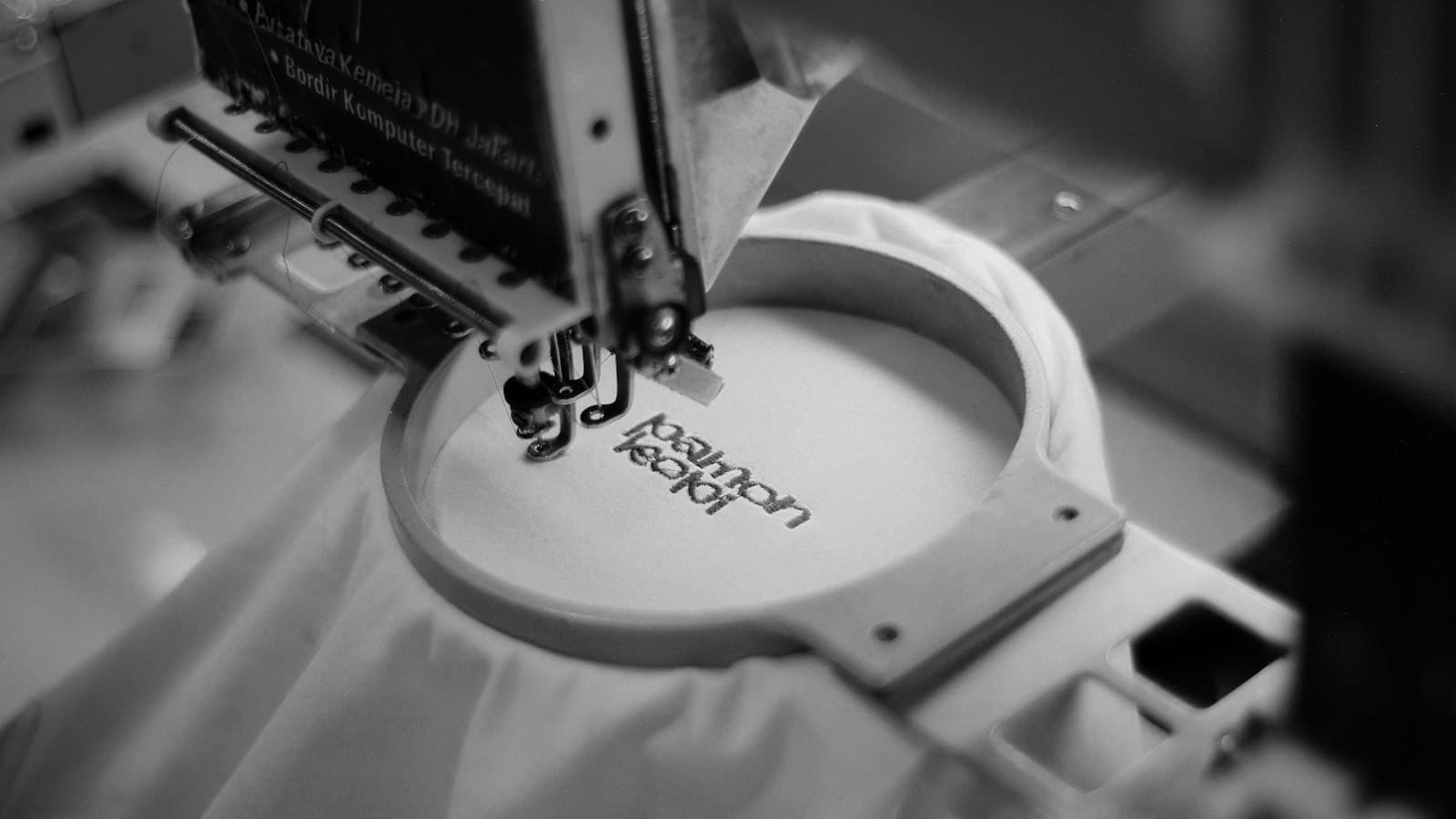
Embroidered lettering has the hardest limits, because a satin stitch has a minimum practical width and letters are built from them.
Rules that hold
- Below the minimum, letters fill in and become blobs
- Bold sans faces embroider best
- Serifs, scripts and thin strokes need extra height to work at all
- Uppercase survives smaller than lowercase
- Stitch density must suit the fabric — fleece swallows fine detail
- On a cap, the crown height caps the letter height
A good digitiser will say when lettering is too small rather than attempting it, and that warning is worth more than the file. A design forced below the limit produces a run of unusable garments, and the fault is not the machine's.
Where a customer insists on small text — a strapline, a web address — offer to move it to a location that allows more size, or drop it. Digitising it anyway costs money for something that will not read.
Names and numbers
Team names and numbers have their own rules, driven by distance and by league requirements.
What to settle first
- Any league specification on number height and placement
- Readability from spectator distance, not from the counter
- How long names fit within the shoulder width
- Whether accented or non-Latin characters are needed
- Placement relative to a collar or a yoke seam
- Whether names are supplied by the club or collected individually
Name collection is where the errors happen rather than in the typography. A spreadsheet retyped by hand produces misspellings, and a misspelt name is a garment nobody can wear — which is why names collected at the point of ordering, in the store itself, are worth more than the convenience suggests.
Checking before you print
Before a run with small type
- Print or stitch one physical sample on the actual garment
- Look at it from three metres, not from the bench
- Photograph it — a camera exposes what the eye forgives
- Check every counter is still open
- Wash it, then look again
- Keep the sample with the job record
Washing matters because ink and stitching settle. Lettering that reads perfectly on a fresh print can lose definition once the fabric relaxes, and finding that out during routine wash testing costs one garment instead of a reprint.
If the sample fails, change the design rather than the process. Type below the limit does not become legible through a finer mesh or a better operator — it becomes legible by being larger, bolder or shorter, and that is a decision to take with the customer before the run rather than after it. The rest of the artwork archive assumes small type was proved on fabric first.