The short answer
- RGB is light on a screen; CMYK and inks are pigment on fabric
- Some screen colours simply cannot be reproduced in ink
- Spot colour is the only route to a genuine brand match
- Always ask for the brand's spot reference, not a screenshot
- A physical sample settles what no file can
Colour complaints usually are not colour errors. The customer saw a bright screen and received an accurate print, and the difference between the two was decided by physics long before anyone opened a file.
Explaining that badly makes you sound defensive. Explaining it early, before the order, turns it into a shared understanding and removes the complaint entirely.
Three systems
| System | Where | How it makes colour |
|---|---|---|
| RGB | Screens, phones, web | Emitted light, added together |
| CMYK | Process printing | Inks absorbing light |
| Spot | Screen print, embroidery thread | A pre-mixed colour |
They are not different notations for the same thing. RGB creates colour by adding light and can produce intensities that no pigment reaches; CMYK creates colour by subtracting light from white and is bounded by what the inks can absorb.
A screen makes light. A shirt reflects it. No conversion makes a garment glow.
Why RGB looks brighter
Vivid greens, electric blues, bright oranges and saturated purples exist comfortably in RGB and sit outside what process inks reproduce. Converted to CMYK they lose intensity, and the loss is not a mistake — it is the honest version.
Colours that disappoint most often
- Fluorescent and neon anything
- Saturated bright greens
- Deep royal and electric blues
- Vivid oranges
- Rich purples
- Metallics simulated as flat colour
Two further variables sit on top. Every monitor is calibrated differently, so the customer's screen and yours already disagree; and the garment colour changes the result, since ink is not fully opaque and the fabric beneath it shifts the hue.
That is why the same ink prints differently on white and on grey, and why a colour approved on one garment cannot be assumed on another — the mechanics are in colour matching and brand colours.
Spot colour
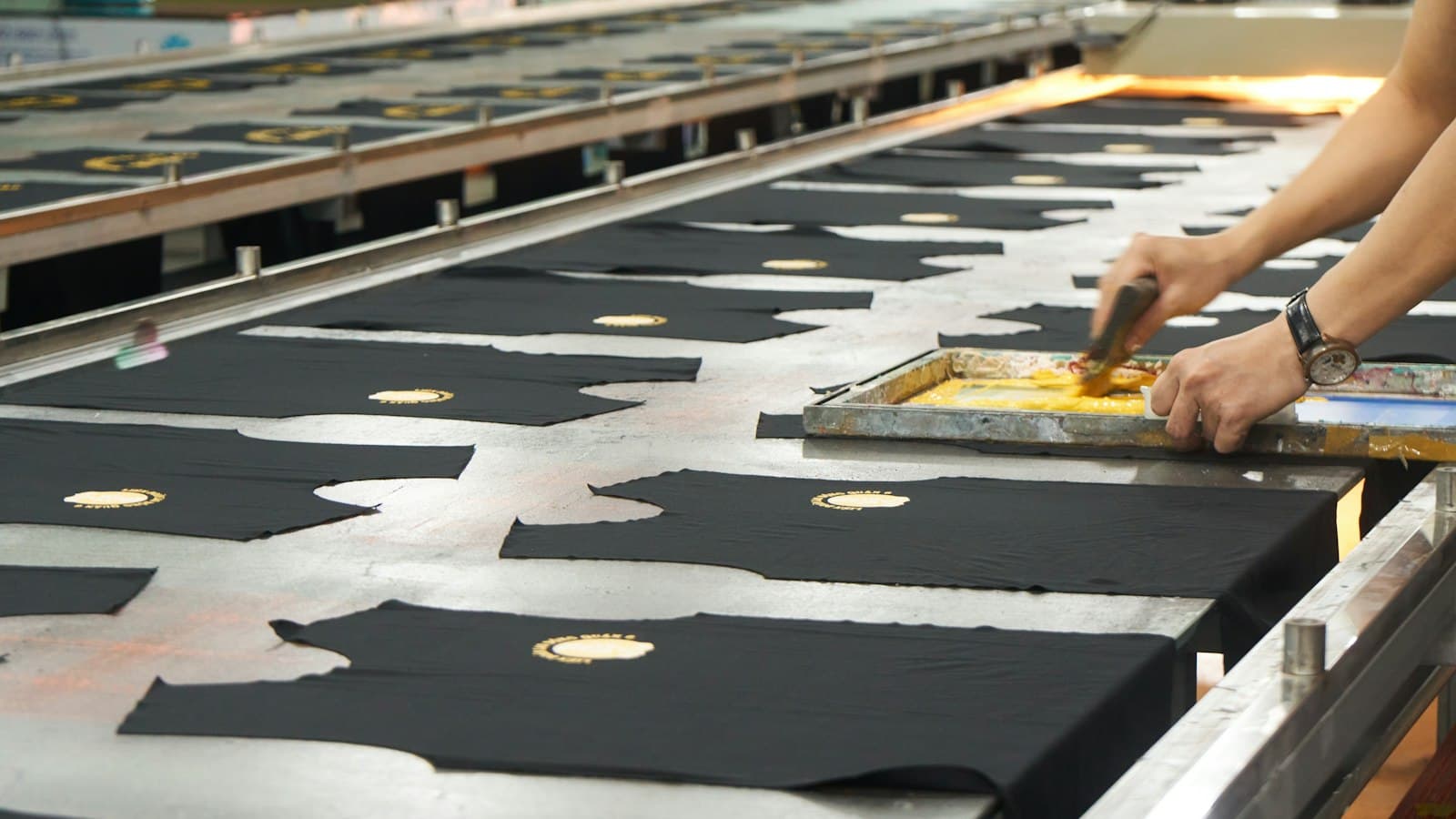
A spot colour is a specific ink mixed to a specific formula rather than built from other inks. It is the only method that genuinely matches a brand colour, and it is what screen printing does naturally.
Why spot wins on garments
- Mixed to a standard reference and repeatable
- Consistent between runs months apart
- Reaches colours CMYK cannot
- One screen per colour — efficient for simple designs
- Embroidery thread works the same way
The trade-off is that each spot colour is another screen and another setup, which is why the separation method is a cost decision as much as a quality one.
What to ask for
Ask the customer for the brand's colour reference — the spot number from their brand guidelines. Not a screenshot, not "the blue in our logo", not a hex value taken from their website.
| What you get | How usable |
|---|---|
| Spot reference from brand guidelines | Ideal — mix directly to it |
| Vector file with spot colours named | Excellent |
| CMYK values | Workable; expect a shift |
| Hex or RGB from a website | A starting point only |
| A screenshot | Almost worthless |
| "Match this printed item" | Possible — send it to us |
Most organisations of any size have the reference written down somewhere, and one specific question usually retrieves it. The question is worth asking every time, because it takes a minute and removes the largest single source of colour disputes.
Digital printing
DTG and DTF work more like CMYK than like spot, which changes the conversation. They can reproduce photographic artwork that screen printing handles only with difficulty, and they cannot hit an exact brand colour the way a mixed ink does.
For most work that is a reasonable trade. For a corporate customer whose brand colour is the point, it is not — and saying so before the order is far better than after, since a digital print is a close approximation rather than a match.
Garment colour matters even more here. Digital inks are less opaque than plastisol, and on anything other than white the underbase and the fabric both influence the result — which is why a digital sample on the actual garment is worth the garment it costs.
Managing expectations
Say it once, early, plainly, and it stops being a problem. Say it after delivery and it sounds like an excuse.
Wording that works
"Screens make colour with light, so they show brighter than ink on fabric can. We mix to your brand reference and match as closely as ink allows, but it will read slightly deeper than it does on your monitor. If the exact shade matters, we can print a sample first."
Offering the sample is what settles it. A customer who has seen a physical swatch approves the real thing rather than an idea of it, and no argument afterwards can be about what they expected.
A working process
What to do on every job with a brand colour
- Ask for the spot reference at quoting
- Record it against the customer, not just the job
- Say what your process can and cannot match
- Offer a sample where it matters
- Get written approval on the proof, colours named
- Keep a printed sample after the run for future reference
Keep the sample where the next person can find it, not in a drawer. A printed swatch of the mixed ink, labelled with the reference and the garment it was printed on, answers next year's question in seconds and does not depend on anyone remembering the conversation.
Recording it against the customer is the step that pays repeatedly. The second order matches the first without anyone re-deriving the mix, and consistency across a year of orders is what a brand-conscious customer actually values.
Where those references live in the system holding the customer record rather than in a notebook by the ink bench, they survive staff changes and they are available to whoever runs the job. That is the difference between a shop that matches a colour once and one that matches it every time. The rest of the artwork archive assumes the colour reference was captured before mixing started.