The short answer
- White is thick and opaque by design, which is why it prints badly
- Coarser mesh and a softer squeegee lay more ink
- Two thinner passes beat one heavy pass almost every time
- Flash properly — under-flashing causes most underbase failures
- An underbase should be as thin as the top colours allow
Every screen printer has a white ink story. It clogs the mesh, it dries in the screen, it prints grey on the first pull and looks perfect on the fifth, and the underbase that seemed fine on press cracks after three washes.
None of that is bad luck. White ink is formulated for opacity, and everything that makes it opaque also makes it difficult to push through a screen.
Why white is difficult
What you are working against
- High pigment load makes it thick and viscous
- It must cover a dark garment in one or two passes
- Thick ink dries in the mesh between pulls
- Heavy deposits take longer to reach cure temperature
- As an underbase, everything above it inherits its faults
- Fibres from the garment lift into it and show
Fibrillation — fibres poking through the ink film — is the failure that annoys customers most, because a print that looked bright leaves the wash looking dull and grey.
Everything that makes white opaque makes it hard to print. You are managing a trade-off, not solving a problem.
The ink
| Type | Best for |
|---|---|
| Standard opaque white | General purpose |
| Low-bleed white | Polyester and blends |
| Low-cure white | Heat-sensitive garments |
| Cotton white | Softest hand on cotton |
| Underbase white | Formulated to be printed over |
| Water-based white | Soft hand; harder to run |
Using one white for everything is the commonest cause of avoidable trouble. An underbase white and a top white are formulated differently, and on polyester a standard white will let the dye through however well you print it.
Stir it thoroughly before use and keep it warm. Cold thick white is harder to push, tempting more pressure, which starts the chain of problems the rest of this piece describes.
Mesh and stencil
White needs a coarser mesh than colours, because the openings must be large enough to pass a heavily pigmented ink.
Setting up the screen
- A coarser mesh than you would use for the same design in colour
- Higher tension — slack screens make white far worse
- A thicker emulsion where a heavier deposit is wanted
- Fully cured emulsion; white is aggressive on a soft stencil
- Clean mesh, since dried ink in the openings shows immediately
Mesh choice trades opacity against detail. A coarse mesh gives a bright opaque white and will not hold fine elements, so a design combining both may need the white split across two screens.
Technique
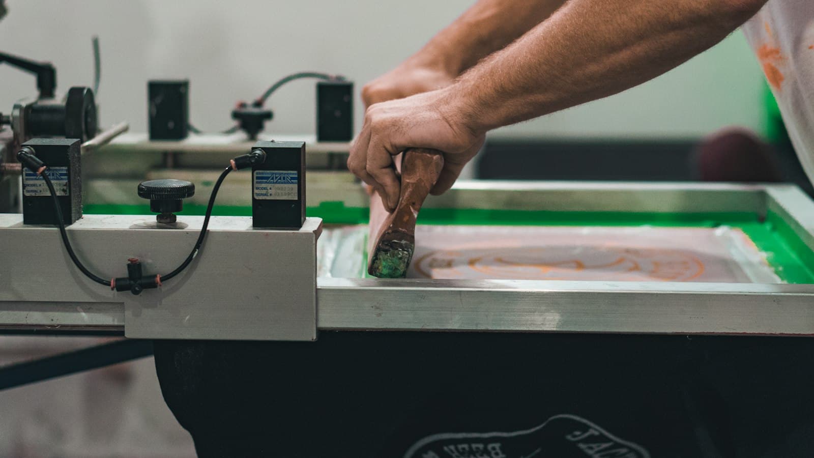
The most useful single change most printers can make is to stop trying to lay all the ink in one heavy pass.
What works
- Two lighter passes rather than one heavy one
- A softer squeegee, which deposits more ink
- Moderate, even pressure — not force
- A slower, controlled stroke
- A light flood that fills without pushing through
- Off-contact set correctly for a clean release
Heavy pressure with white is counterproductive. It pushes ink sideways under the stencil, blurs the edge and distorts the mesh without improving opacity — the fuller argument is in squeegees, angle and pressure.
Keep the screen wet. White dries in the mesh faster than colours, so a pause of a few minutes needs a flood stroke before printing resumes, and a longer stop needs the screen cleaning.
Flashing
When white is printed under other colours, it must be flash cured — gelled enough to print over without pulling up.
Getting the flash right
- Flash until the surface is dry to the touch, not fully cured
- Under-flashing causes the next colour to pick up ink
- Over-flashing wastes cycle time and can scorch the garment
- Let the platen cool, or the next print sticks
- Keep the flash time consistent across the whole run
- Cooling platens or a cooling station help on long runs
Platen heat is what causes the mysterious drift on a multi-colour run — the first fifty garments print cleanly and the next fifty stick, because the platens have been heating steadily under the flash. The relationship between flashing and cycle time is covered in flash curing on multi-colour jobs.
Underbases
An underbase exists to let the colours above it read true. It is not meant to be a bright white print in its own right.
Rules for a good underbase
- As thin as the top colours allow — a heavy base is a stiff print
- Choked slightly so it does not show at the edges
- Printed through a mesh suited to the detail above
- Flashed properly, then cooled
- Included in the total ink film when setting cure
Choking is the detail that separates good multi-colour work from average. An underbase printed at full size peeks out around the top colours as a white halo, and a slight reduction in the base removes it — which belongs in the separation rather than being corrected on press.
Remember that the total ink film governs cure. A heavy underbase plus several colours takes longer to reach temperature throughout than a single print, so a dryer setting proven on one-colour work may not cure this — and wash testing is what tells you.
Troubleshooting
| Symptom | Usual cause |
|---|---|
| White looks grey | Too little ink; mesh too fine |
| Fibres showing through | Deposit too thin; no flash and second pass |
| Print feels like cardboard | Too much ink; too many passes |
| Blurred edges | Too much pressure, or low tension |
| Ink drying in the screen | Pauses; ink too cold or too stiff |
| Next colour lifting the base | Under-flashed |
| Cracking after washing | Undercured, or the film is too heavy |
Notice how many of those are opposite faults with a narrow band between them. Too little ink looks grey and picks up fibres; too much feels like cardboard and cracks — and the correct answer is a controlled deposit rather than an extreme in either direction.
Record the settings that worked against the garment and design so the next run starts there rather than being rediscovered. Mesh, ink, flash time, passes and cure — noted on the job record rather than in one printer's memory — is what makes the second run of a white-on-black design straightforward for whoever is on shift. The rest of the production archive assumes white was set up deliberately rather than fought with.